2013
Maestro
A better email experience for Windows Phone.
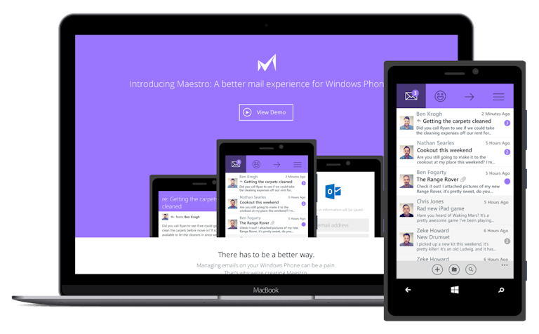
In 2012, after years of being a Mac and iOS user, I picked up a Windows Phone to try something new.
I was surprised by how fluid it felt due to its use of interactive animations, and how solid the core OS was. Unfortunately, the app store was a ghost town, and was missing a wide variety of tools and utilities. On a flight to Chicago in 2013, I came up with an idea for a new email client. Maestro was born.
Concept
What is Maestro?
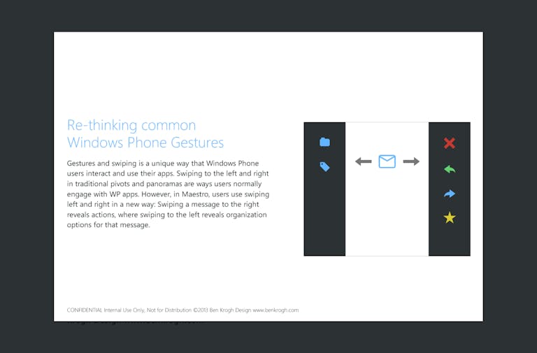
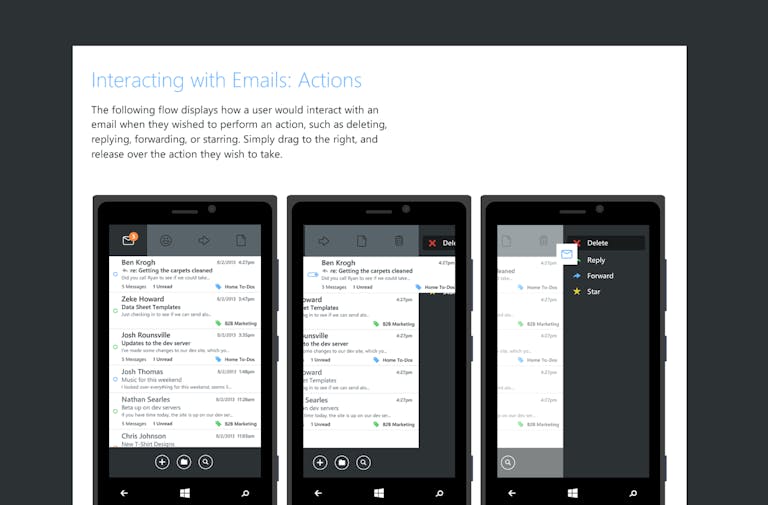
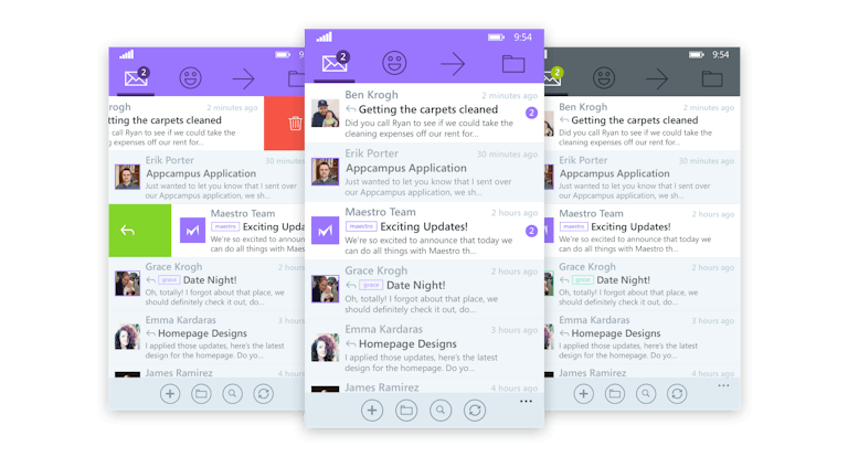
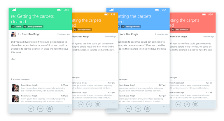
I thought about new ways to interact with email, and things that were missing from the native Windows Phone client. Things like gestures, labels, and clear design were incredibly important to me. Windows Phone was clean, but unfortunately it also felt a bit lifeless. At the time, "Metro" design was a rigid template system that didn't leave much room for variation between apps.
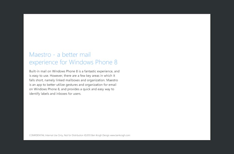
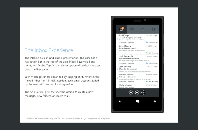
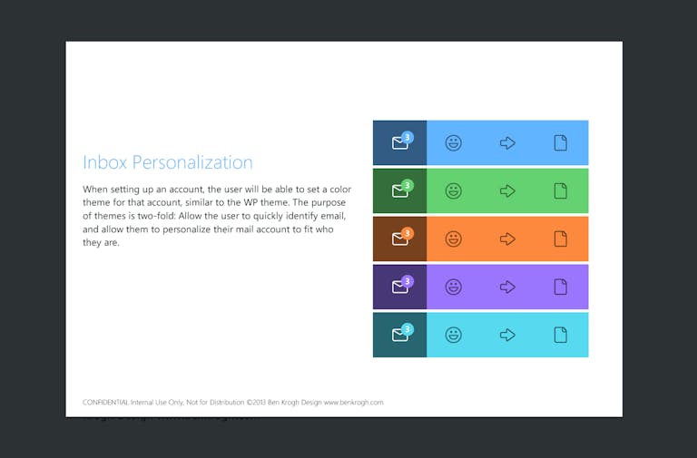
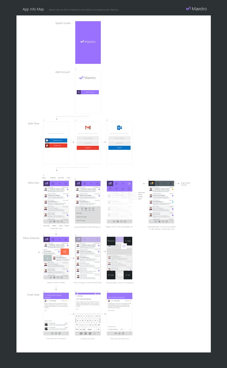
I put together a pitch deck that covered the concept, from the basic ideas to some UX flows and early designs. I pitched the idea to the app studio Hidden Pineapple, and was able to trade equity in the app for development resources. What follows is the deck I put together to pitch Maestro to potential developers or investors.
Identity Design
The Logo
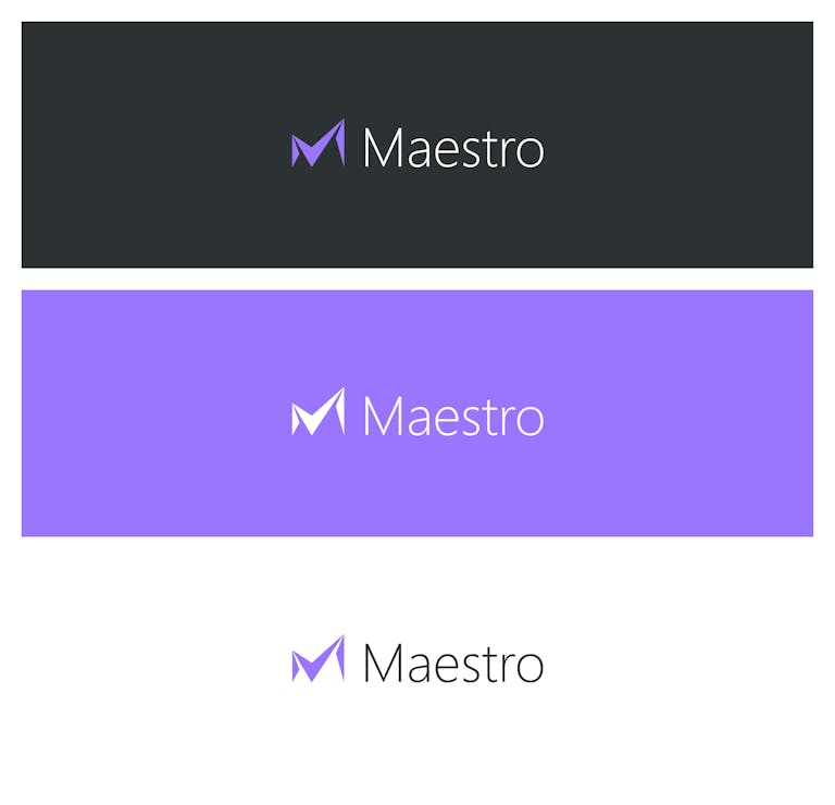
The logo was designed to reference the "M" in Maestro and two main visual themes: a checkmark and an envelope. Since the mark would be used as an app icon, it needed to be distinct enough to stand out among a user's home screen. This desire to stand apart from competitors also led us to using purple as Maestro's main brand color. Bold, unique, and not a remix of Outlook's ubiquitous blue.
At the same time, we really embraced Microsoft's established Metro language. It used Segoe as it's wordmark, and the sharp and distinct geometric icon referenced Microsoft Office's bold rebrand that had launched prior to Maestro. It felt like part of the Windows Phone family and design language.
UI Design
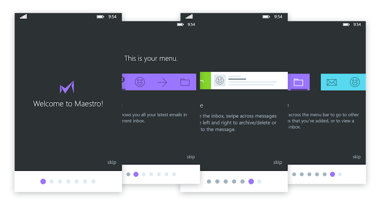
The Email App
The team of developers and I submitted Maestro to AppCampus, a Windows Phone app accelerator started by Microsoft and Nokia to promote new, quality apps for the app store.
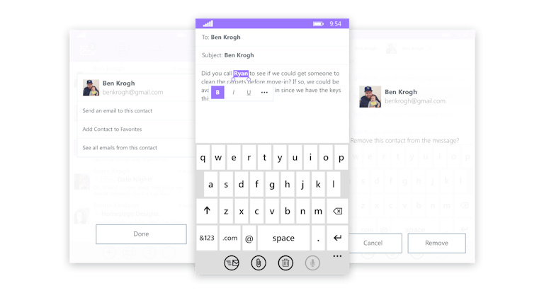
A tremendous amount of time went into the app design itself. I put together a design flow document before we sent it to the AppCampus application process, and our pitch was accepted. We received a small amount of funding to get Maestro completed and shipped.
App Marketing
The Outcome
Maestro launched on the Windows Phone Store as a free download for the first 24 hours, and was downloaded over 30,000 times in the first 24 hours. Unfortunately, due to a fluke in the Windows Phone approval process, our price change to $2.99 wasn't put through the store until over 76 hours later. We gave away over 70,000 downloads of Maestro before we started making a single dime.
After the free period ended, we received very few paid downloads. We had little to no capital to pay for development, and we were unable to receive the last of our funding from AppCampus before the program shut down. Maestro became one of the biggest failures of my career, and a frustrating end of over two years of work.
It was hard for me to swallow. I don't like to lose, and I certainly don't like to lose for reasons outside of my control. However, after reflecting on the complicated journey that Maestro had, I realized that it was an incredibly important experience. It was the first app I founded, and the first time I hired a team of developers. It was also the first time I led a team, and the first time I had to consider marketing and listening to user feedback. Maestro wasn't a financial success, but what I gained through the experience was invaluable.